
Five neutrals, read against skin and against the fabric that carries them. Why silk returns light and lace absorbs it, which shade disappears under which clothing, and how to choose without a season chart.
The house keeps five neutrals and no others: Noir, Ivory, Porcelain, Smoke, Charcoal. It is a small country, and deliberately so. A lingerie palette is not a mood board — it is a working set of tools, each one solving a problem the others cannot. What follows is how to read them: against your own skin, against the light in your own room, and against the clothes you will put on over them and then forget about for the rest of the day.
The five, and what each one is actually for
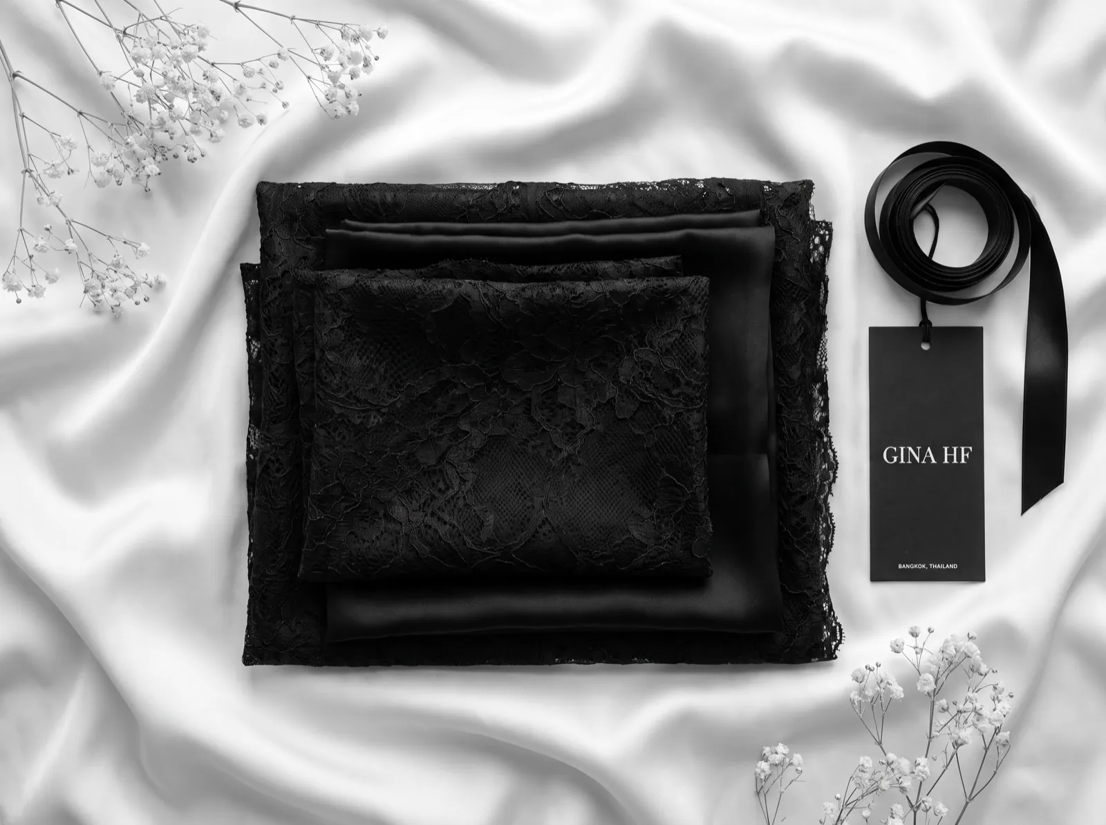
Noir is the shade that reads as intention. It holds an edge on the body — the eye follows a black band and a black strap as line rather than as garment, which is why a well-cut Noir bra flatters almost universally and why almost nothing else does the same job under a dark dress. Ivory is warm, faintly golden, the colour of a candle rather than a page. Porcelain is Ivory's cool cousin: a white with a breath of pink in it, closer to the inside of a shell. Smoke is a pale silvered grey with no warmth at all. Charcoal is Noir's softer relative — dark, but with grey rather than blue in the base, so it recedes where Noir declares.
How the five read against skin
The old advice is to find your undertone and stay in your lane. It is not wrong, but it is coarse, and it fails at the exact moment it matters most — the moment cloth touches skin and the two begin to trade light between them. Skin is not a flat swatch. It has a translucency that borrows from whatever sits beside it, which is why the same Ivory can look luminous at the shoulder and muddy at the ribcage on the same woman.
- On deep and rich complexions, Ivory is the strongest of the five: warm against warm, it lifts rather than chalks, where a cool Porcelain can read slightly ashen at the edge of the band.
- On olive and golden skin, Smoke does something unexpected — the grey neutralises the yellow the skin is already carrying, and the result is a clarity that pure white never gives.
- On very fair skin with pink in it, Porcelain vanishes into the body almost entirely, which is either the point or the problem depending on what you want the piece to do.
- Noir and Charcoal are the two that flatter across every complexion, because they work by contrast rather than by agreement. Noir sharpens; Charcoal softens. Choose by the mood, not the skin.
The same colour, twice: silk against lace
Here is the thing no colour chart will tell you. Ivory in silk and Ivory in lace are not the same colour, and no dye lot in the world will make them so. Silk is a smooth continuous filament; it returns light in a single direction, so the surface reads bright and the colour reads a half-step lighter and warmer than the swatch. French lace — Chantilly, Leavers — is a net. It is mostly holes. Light entering a lace goes into the structure, bounces between threads, and much of it never comes back out. The eye reads that loss as depth. The same Ivory becomes a shade deeper, a shade quieter, faintly shadowed at every motif.
This is why a slip and its matching lace trim can look like a mismatch on the hanger and like one garment on the body, and why the house dyes silk and lace to a deliberate half-step apart rather than to an identical number. Tulle sits somewhere in between: fine enough to pass light through, dense enough at the layered edge to darken by a full step where two panels overlap. Hold any of the five up in one hand as silk and in the other as lace, in daylight, and you will never trust a flat colour swatch again.
“A neutral is not a colour we choose once. It is a conversation between the cloth, the skin and the light in the room — and the cloth changes its answer every time.”
The atelier
What disappears under what
The most useful thing a neutral can do is not to be seen. And the rule most women are taught — wear white under white — is precisely backwards. White under white is the single most visible combination there is, because two whites are almost never the same white, and the eye reads the mismatch instantly as an outline. What actually disappears under a white or pale shirt is the shade closest to your own skin, seen through the cloth: Porcelain on fair skin, Ivory on warm and deep skin. The garment stops being a separate object and becomes a continuation of the body.
- Under white and pale shirting: Porcelain or Ivory, chosen to sit near your own skin tone. Never white.
- Under grey, and under anything pale and cool — silver, stone, pale blue: Smoke, which carries no warmth to bleed through.
- Under black and true navy: Noir, and only Noir. Charcoal under black reads as a faint lightening at the band.
- Under a dark but soft cloth — a charcoal knit, a deep grey silk: Charcoal, which will not draw the hard line that Noir draws.
- Under anything sheer that you intend to be seen through: Noir or Ivory, chosen as a decision rather than a concealment. If the piece will be visible, let it be the thing you meant.
Choosing without a season chart
Seasonal colour analysis was built for outerwear seen across a room. Lingerie is seen at arm's length, in low light, by you and by no one else — a different problem entirely, and one that answers to touch and proximity rather than to theory. So test the way the garment will actually be worn. In the evening, in the light you undress in, against bare skin rather than over a camisole. Hold Ivory and Porcelain to the inside of the forearm where the skin is thinnest and most honest, and look for the one that makes the skin look lit rather than the one that looks whiter.
Then buy in narrow depth rather than broad range. Two shades worn constantly will teach you more than five worn occasionally, because you will begin to notice the small things — that Smoke goes slightly warmer after the third wash, that Noir in silk keeps its density where Noir in mechanical lace does not. That noticing is the whole education. It is also the reason the house keeps five and not fifteen: a palette you know completely is worth more than a palette you are still guessing at.
Learn your two, then hold them. What you are building is not a colour scheme but a certainty — the knowledge that whatever you put on over it, the layer underneath is already right, and you will not think about it again all day. That is the quiet luxury of a resolved palette. Not that anyone sees it. That you stop having to check.